Glazeworks brand guide · 2.0
light is the glaze
A glaze is a thin, glossy coat over a surface. Neon does the same to the edges around it: a halo of light. That's our brand. Real hardware, real people, coated in neon glaze.
01
the idea
Three phrases carry the whole brand. Use them in copy, decks and briefs.
light is the glaze
Our line. Glaze isn't a drip or a texture any more; it's the light we put on things.
neon halo
The glow around an edge. It's how we frame what matters: the hero, the main button, the sign.
neon glaze
The finish. A thin coat of light on borders, type and lines, never a fill on big areas.
02
logo
The glaze-drip wordmark. The drip is the one place the full colour glaze still lives.
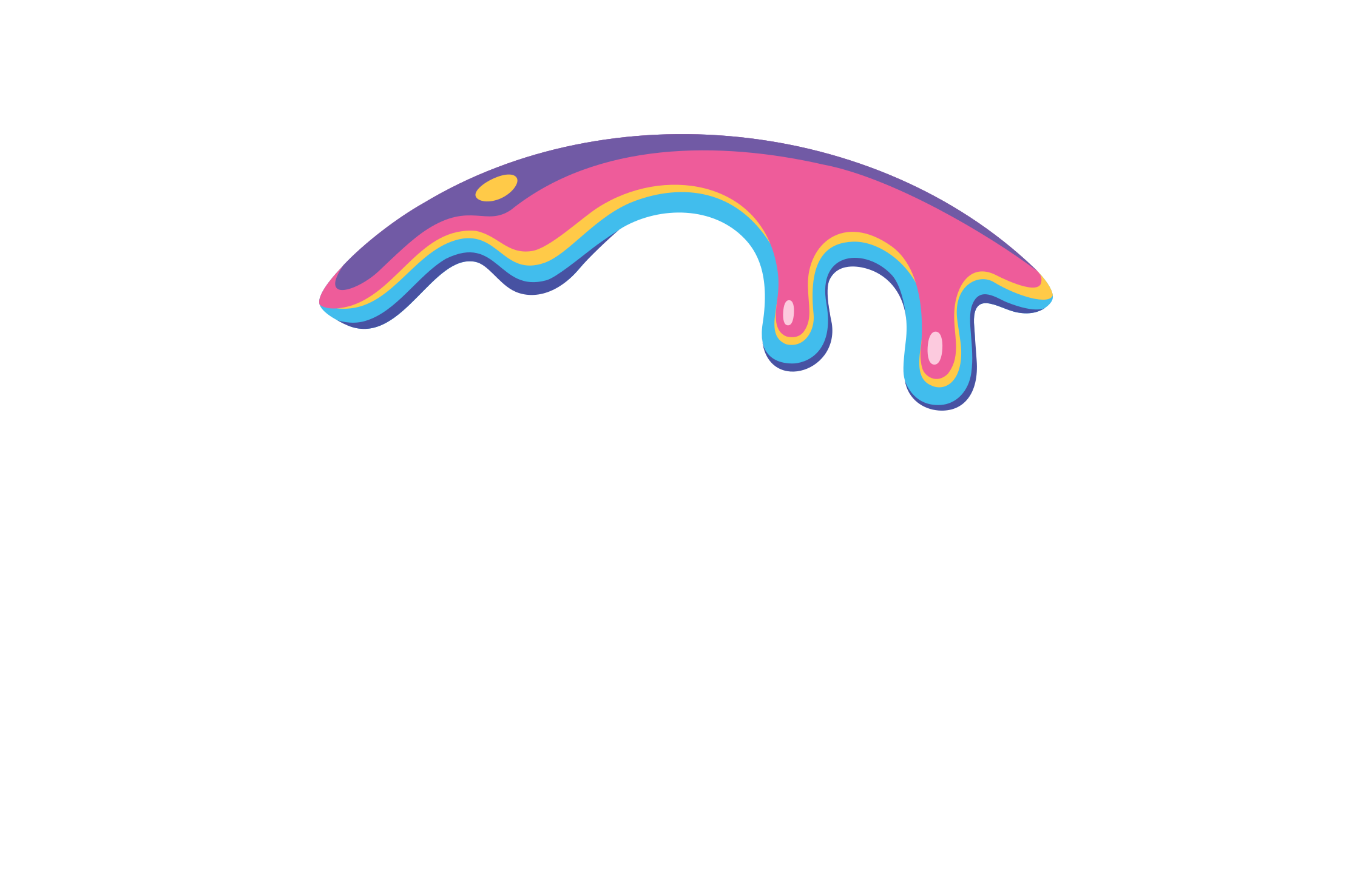
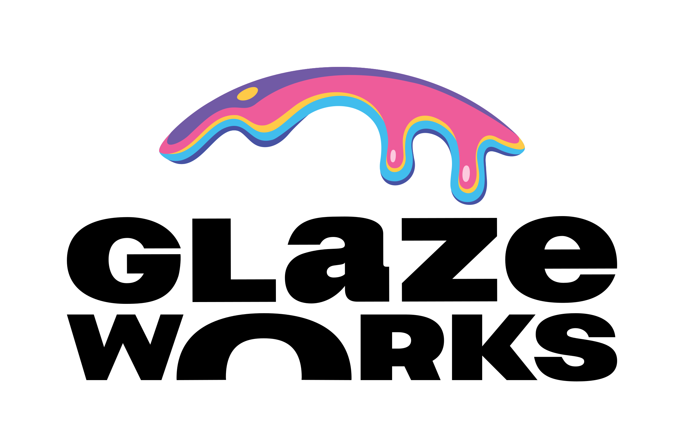
Primary: full colour on dark.
The neon sign: for hero moments and events.
On light backgrounds: full colour, black type.
- Do: Clear space of at least half the “O” on every side.
- Do: Use the files from the media pack as they are.
- Don't: Recolour, stretch, rotate, outline or add effects to the logo.
- Don't: Set the wordmark on one line, or rebuild it in another font.
03
colour
Dark first. Roughly 80% ink, 12% white type, 8% neon. One neon colour at a time.
Ink
#07060A · Backgrounds
Graphite
#121018 · Panels, cards
White
#FFFFFF · Type
Mist
#B3ADC1 · Secondary type
Neon
Hot pink #FF5FA8 ↔ aqua #3FD4FF
Never both at once. Online it slowly shifts between them; in print and on stills, pick one.
Logo glaze
#EE5C9A · #715AA5 · #41BDED · #FFCA48
Lives inside the logo only. Not on buttons, borders, text or backgrounds.
04
the neon system
Full neon only where it matters. Everything else gets a thin line faintly tinted by the same neon, so the whole page shifts together.
Neon border: the main action
Get updatesNeon word: one per headline, at most
for hardware
Neon line: section breaks and markers
Quiet line: every other border (hover me)
Cards, lists and dividers stay thin and calm, and only glow on hover.
- Do: Full neon on: the hero frame, the main button, the sign-up, form submit buttons.
- Do: One shared flicker for every glow, like a sign on one circuit.
- Don't: Neon on every card. If everything glows, nothing does.
- Don't: Two neon colours side by side, or neon on a busy photo without a dark backing.
05
type
Two families with strict roles.
Tovar: headlines
where ideas get built
Short headlines only, written lowercase. Tovar has no Ü, Õ, Ä, Ö, Š or Ž: set Estonian words in Stack Sans.
Stack Sans Text: everything else
1,100 m² of lab, workshop and event space
Light for body text, Bold for subheads and labels. Ülemiste City, Tallinn.
06
photography
The real place, real people, real machines. That's the whole point.
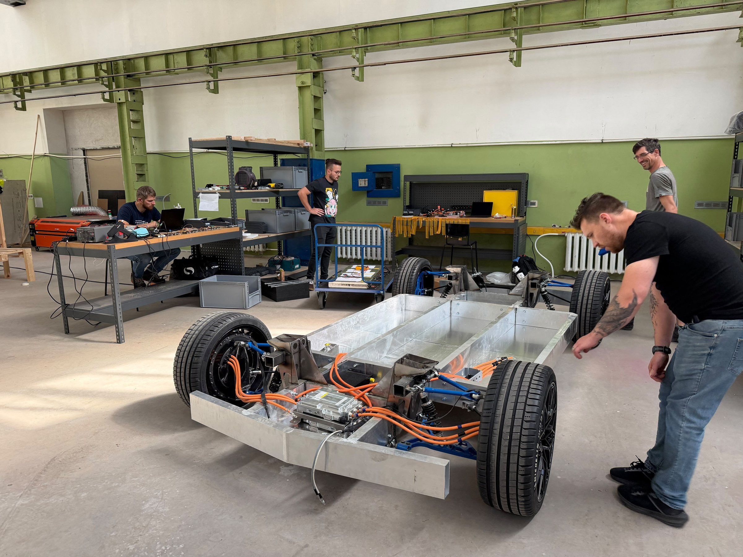
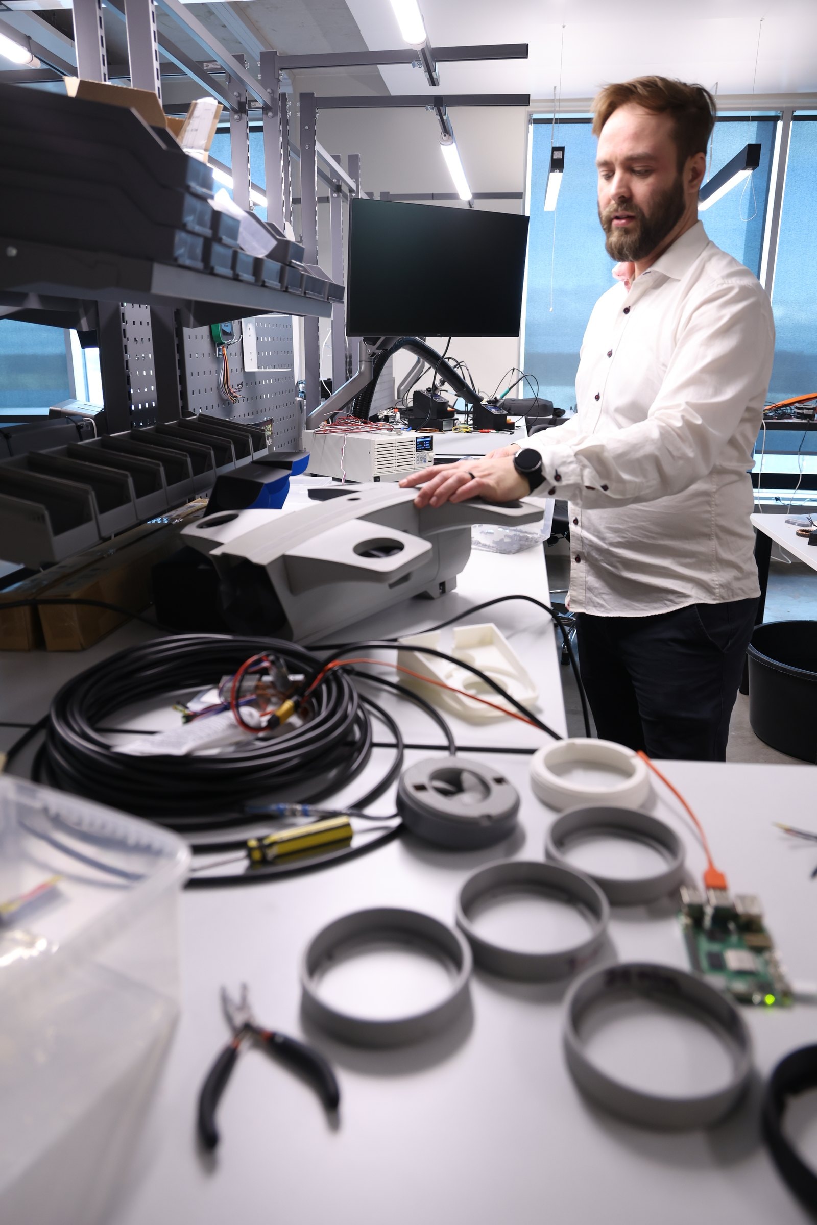
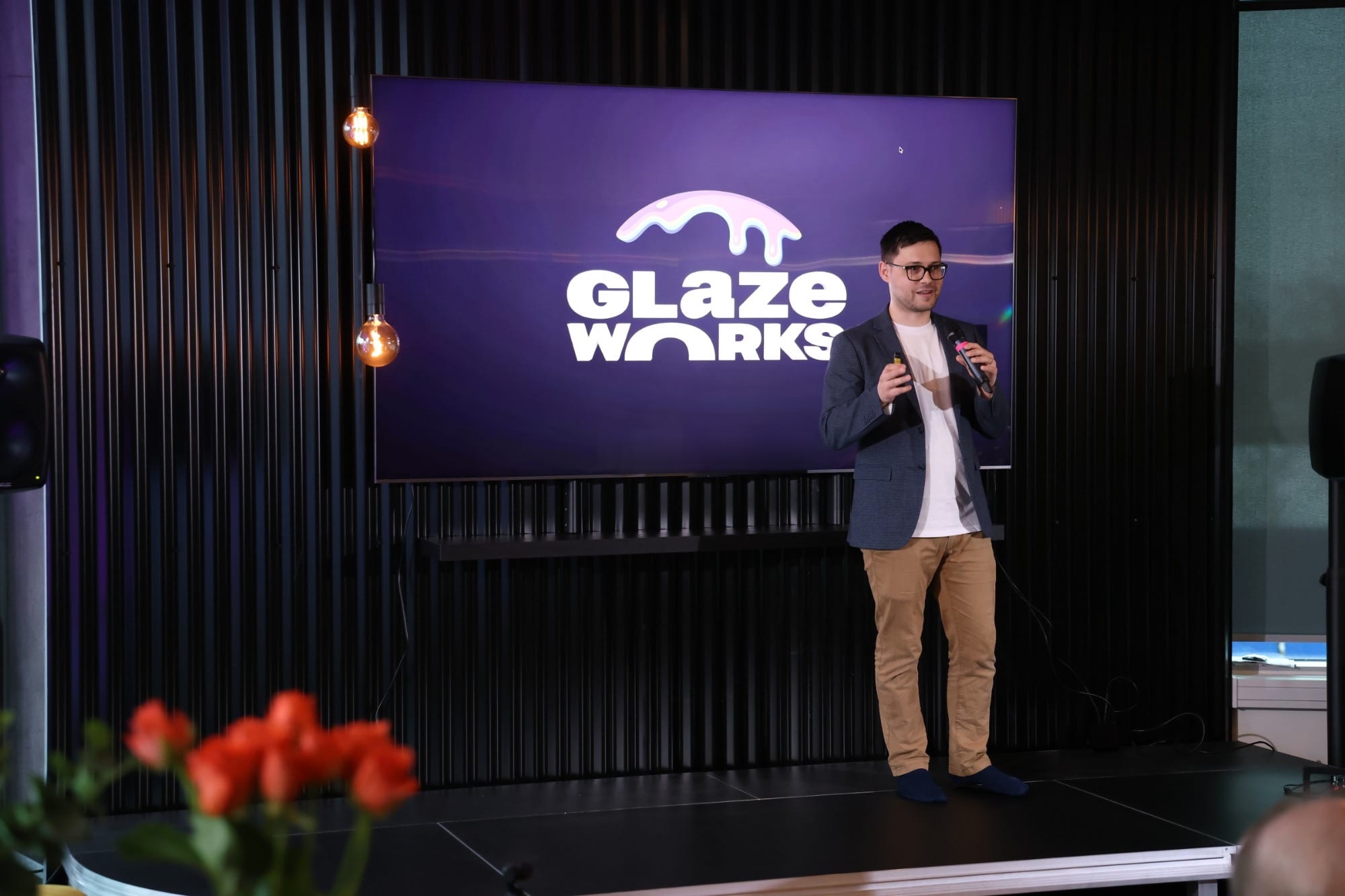
- Do: True colour, full brightness. Darken only the area behind text.
- Do: Hands, tools, builds in progress, people at events.
- Don't: Renders, mockups or stock photos.
- Don't: Colour washes, tints or glaze artwork over photos.
07
motion
Slow and steady, like a lit sign. Nothing bounces.
- Do: Neon shifts pink ↔ aqua over about 10 seconds, pausing at each end.
- Do: A brief flicker every ~9 seconds, the same moment for every glow.
- Do: Content fades up gently as it scrolls in.
- Do: With reduced motion turned on, everything holds still on pink.
08
voice
Direct, practical, a bit playful. Say what's here and what people can do with it.
- Do: Short sentences. Real numbers we can back up: 1,100 m², three spaces.
- Do: Lowercase Tovar headlines with one idea each.
- Don't: Hype: “world-class”, “revolutionary”, “next-gen”.
- Don't: Exclamation marks.
09
retired
From brand guide 1.0. Please don't bring these back.
- Don't: Drip artwork, photographic or vector.
- Don't: Sprinkles, candy textures, wavy gradient blobs.
- Don't: The pink-to-blue gradient on buttons, borders, text or backgrounds.
- Don't: 3D renders and mockups of the space.